Modi to SEL: New Name, Same Great Engineering
Earlier this week, we revealed a new identity for our lab. The new graphic identity and name is already reflected on our website and Twitter account, and has been used in several project deliverables. This is our first significant effort to establish an identity for ourselves.
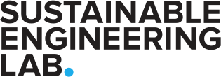
Our new logotype
The name change is meant to accommodate the growing scope of our work. When we looked at our past projects, we found a diverse set of research and software projects—developing planning and decision-support tools for infrastructure, food-energy-water nexus in agriculture, urban energy, solar mini-grid systems, data collection tools, and mobile health tools. We found the common thread in our work to be a long term view on engineering solutions to critical infrastructure—solutions that, when optimal, drive development, but when suboptimal paralyze entire economic, political and healthcare systems.
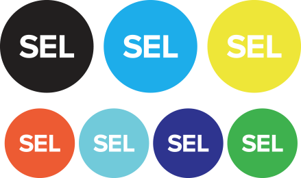
Our new icon in our new color palette
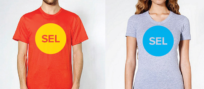
We felt that the length of “Sustainable Engineering Lab” necessitated an acronym. SE-Lab was confusing, so we thought SEL would work. As an added benefit and pun for the lab’s French speakers and partners working with the Earth Institute, we can now be identified as “SEL [salt] of the Earth [Institute]”. We created both a mark and a logotype so our identity could live in various applications.
A major part of our design challenge in creating our graphic brand was to embody the values the lab, something that seemed open, pragmatic, and forward thinking. We tried a few approaches, including visualizing our goals for sustainable solutions by tilting an infinity symbol to make the “S” in SEL. In the end, we decided to focus on all three words of the lab equally and remove superficial ornamentation. The circle represents so much of what we do: cradle-to-cradle thinking, openness to the public and with partners, definitive research findings, points-of-interest on a map, nodes in an energy network, etc.
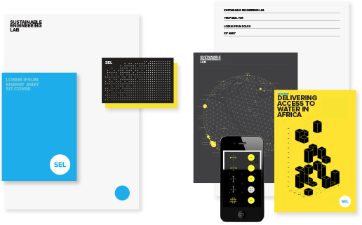
Letterhead and potential digital and printed applications of the new identity
Chart styles
Tote bags
We designed a visual system with the same purposeful, non-ornamental approach as the logo. Most of the outputs from the lab are reports and information graphics, so we focused on those first. As we continue to produce outward facing documents, we will continue to build out the visual identity. We are using Proxima Nova as our typeface for print and some digital applications.