The Nigeria MDG Information System (NMIS) Takes Open Data Further
Right now is an exciting time for our Scale Up Initiative in Nigeria. We are currently in the process of transferring data, technical knowledge and planning resources to our local partners on the ground, the Office of the Senior Special Assistant to the Millennium Development Goals (OSSAP-MDGs).
As you may have read previously, SEL is helping the Nigerian government track and assess their progress toward achieving the Millennium Development Goals. Put simply, we’ve created surveys and collected data throughout the entire country to create Nigeria’s first nation-wide inventory of health, water and education facilities. This information is then used to better plan future infrastructure investments and obtain federal funding to accomplish the MDGs.
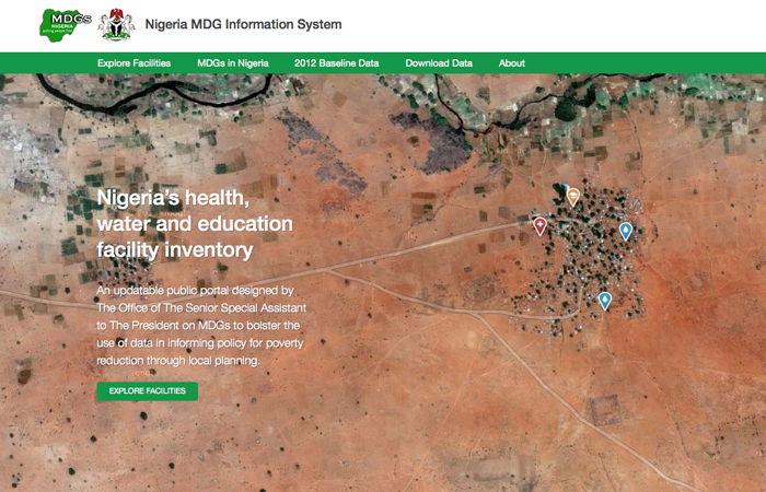
The tool built to help make this planning possible is the Nigeria MDG Information System (NMIS), a live and soon to be public site that visualizes the data collected. The goal of this database is to make the data available to planners, government officials, and the public, to be used to make strategic decisions for planning relevant interventions. It’s the bridge between collecting the data and actually using it.
When engineering how to build NMIS, among other data-driven projects, discussions about open source, open data and OpenStreetMap can often be heard around the lab. Our team follows an open framework as often as our projects allow. This is a great practice, but time is also spent thinking about how that idea can be taken further, to more fully consider the end user. Until now, the end user of NMIS has been a Technical Assistant of OSSAP-MDGs assigned to a Local Government Area (LGA) of Nigeria. Soon, NMIS will launch an open version, expanding the audience to the general public. In both cases, the majority of users will not have extensive training in data analysis.
To illustrate just how difficult it would be for someone to interpret the data without NMIS, shown below is an example of what raw data from a survey looks like.
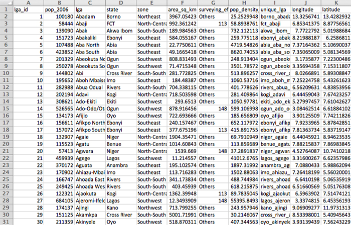
Looking at a spreadsheet with row upon row of data doesn’t give a very clear picture of the reality that data represents, at least not quickly or easily. A lot of back end calculations need to be performed in order to make the data meaningful. We must consider the impact of solely making the raw data public. Would the Technical Assistants have the ability to use the data for their planning?
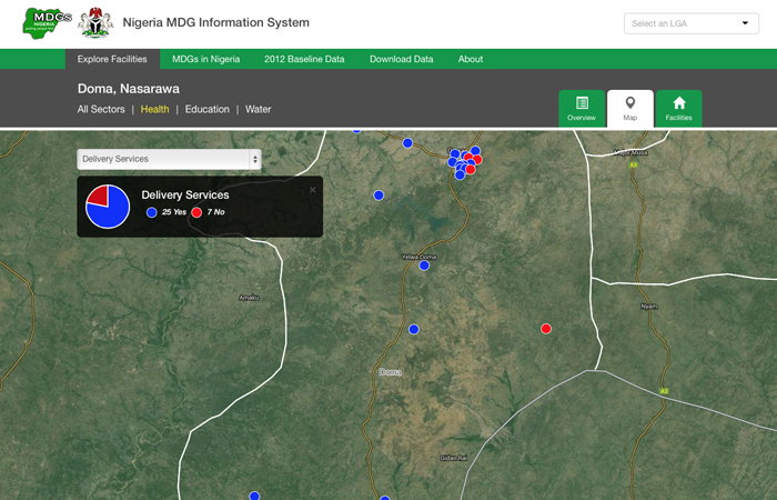
The power of NMIS is its ability to visually display the data for interpretation, making the 200,000+ surveys conducted not just collections of data but useful statistics to facilitate change. Users can view critical indicators of progress for health, education and water of an entire Local Government Area, filter content by sector, view a map of facility locations or get an in-depth look at each facility. For example you could determine which health facilities provide pregnancy delivery services. In summary, NMIS illustrates relationships not easily seen otherwise. The result is that users take-away specific information relevant to them, and not an overwhelming data set. Therefore their planning is more efficient and thorough because of it.
NMIS’ presentation of data for use in planning facilitates action towards the real objective: investing in interventions that will improve the lives of Nigerians.